Leading consumers to critical info
The Consumer Financial Protection Bureau (CFPB) has thousands of financial education resources, but they were buried within the site’s information architecture. My team conducted extensive research to create a new architecture and surface key money topics in the site’s main navigation.
As we prepared to launch the new navigation, we turned to designing landing pages to introduce the money topics and route consumers to critical information.
About the project
Project team
UX/UI designer (me)
User researcher
Product manager
Content strategist
Front end developer
Back end developer
My lead responsibilities
Product design
Art direction
I also contributed to…
Content strategy
User research
Workshop facilitation
Project background
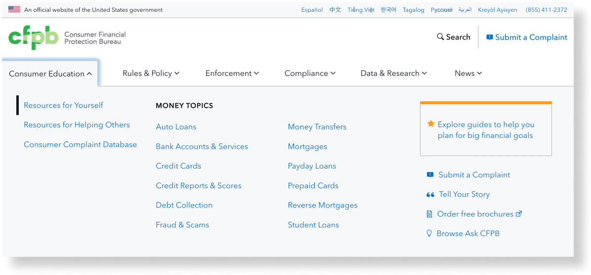
The CFPB’s site information architecture (IA) lacked support for consumer navigation, information self-discovery, and findability. Consumer-facing products were organized in a way that made sense from an operational perspective, but consumers view the CFPB through the lens of what they need, not by how services are organized. The site’s IA did not clearly surface information for consumers, particularly those navigating a financial hardship.
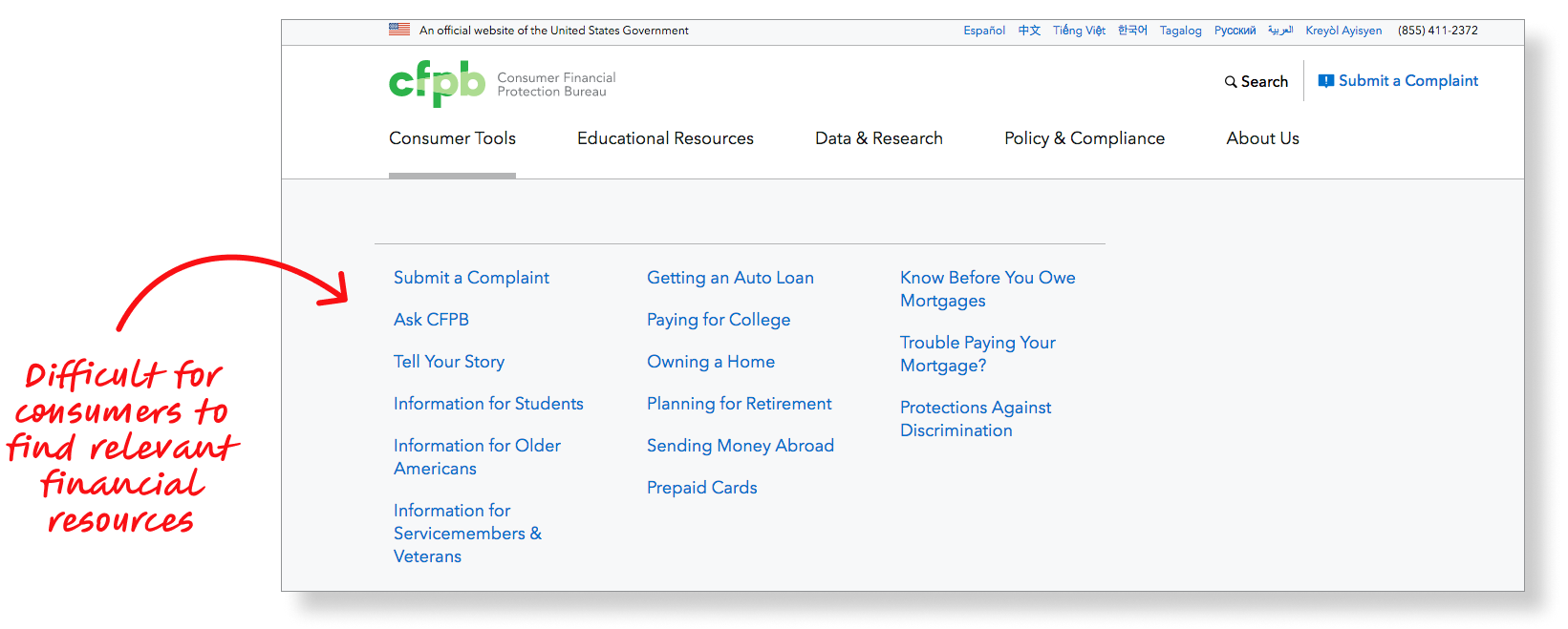
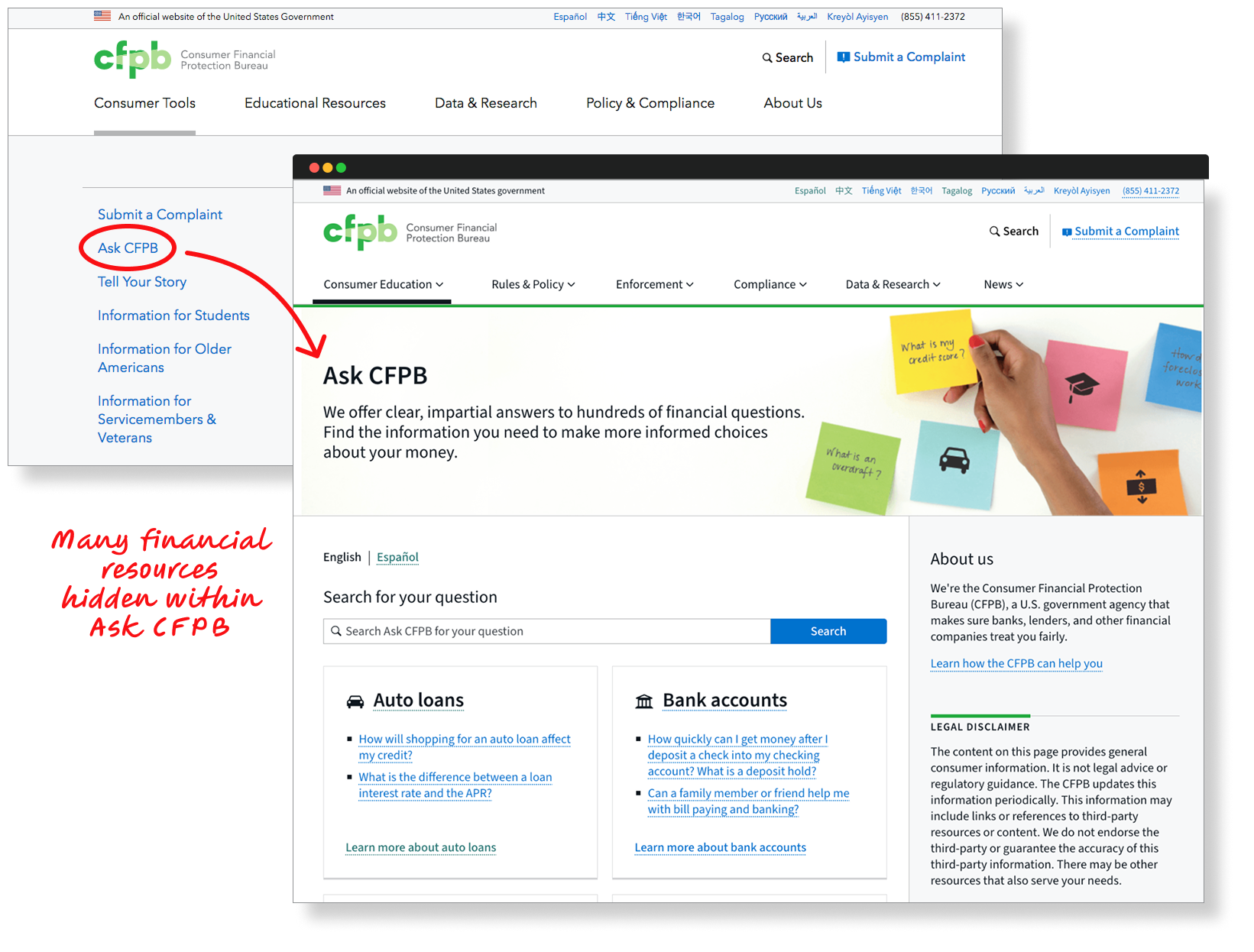
In particular, the site’s main navigation menu didn’t prioritize information for consumers facing immediate financial problems. In a previous project, I redesigned Ask CFPB, a database of common financial questions and answers, but these resources for consumers weren’t clearly presented in the site’s main menu.
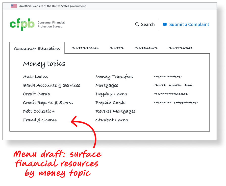
During a discovery project, my team proposed and tested new IA options for consumer content. After two rounds of tree testing with a total of 243 consumers, we arrived at an IA organized primarily by money topics, mirroring Ask CFPB’s organization, and were now ready to implement it.
Creating personas
Before redesigning the site’s main navigation and creating money topic sections, we articulated who these resources were meant to serve. We revisited research conducted for the CFPB by IDEO, who interviewed 32 consumers with different backgrounds, incomes, life situations, and abilities across the country. Many of these consumers had or were currently facing financial hardships.
“Maybe I could pay the loan people off and everything could be clear. But they see my credit report and they say I’m not to be trusted. Nobody’s going to accept me nowhere. I can’t achieve my goals.”
“I try to look at spending versus budgeting, but things happen. I sometimes didn’t get rent on time, so things happened.”
“I guess I know [my payday loans] didn’t kind of go away, but I don’t know what happened with that. I don’t have to worry about it until it worries about me, I guess.”
Consumers behave in different ways depending on their situation and level of engagement and empowerment. Simply put, behavior is dynamic. IDEO articulated this as “modes of action,” such as being in “panic mode” where a consumer has encountered a problem and is struggling to resolve it to “plan” mode where they have identified a life goal and are looking for ways to pursue it more effectively.
These insights were buried in research reports, so I created “mindset cards”—similar to personas—to make it easy for the team to reference the insights as we designed.
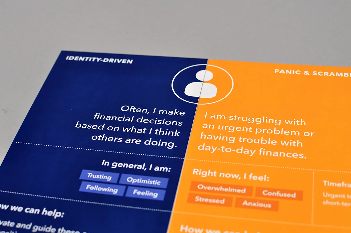
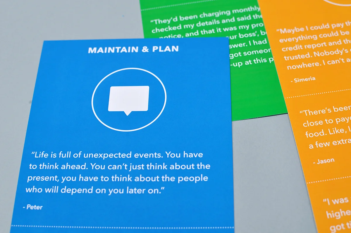
Mindset cards—similar to personas—I created to surface insights from IDEO’s research with consumers
Auditing & wireframing
We turned our attention to designing a page structure for the new money topic landing pages. We conducted an audit of consumer-focused content on the site, capturing details such as each page’s purpose, intended audience, content owner, and performance information including unique page views, average time on page, bounce rate, and exit rate. This helped us identify potential pages to link to from the landing pages as well as gaps in the CFPB’s offerings.
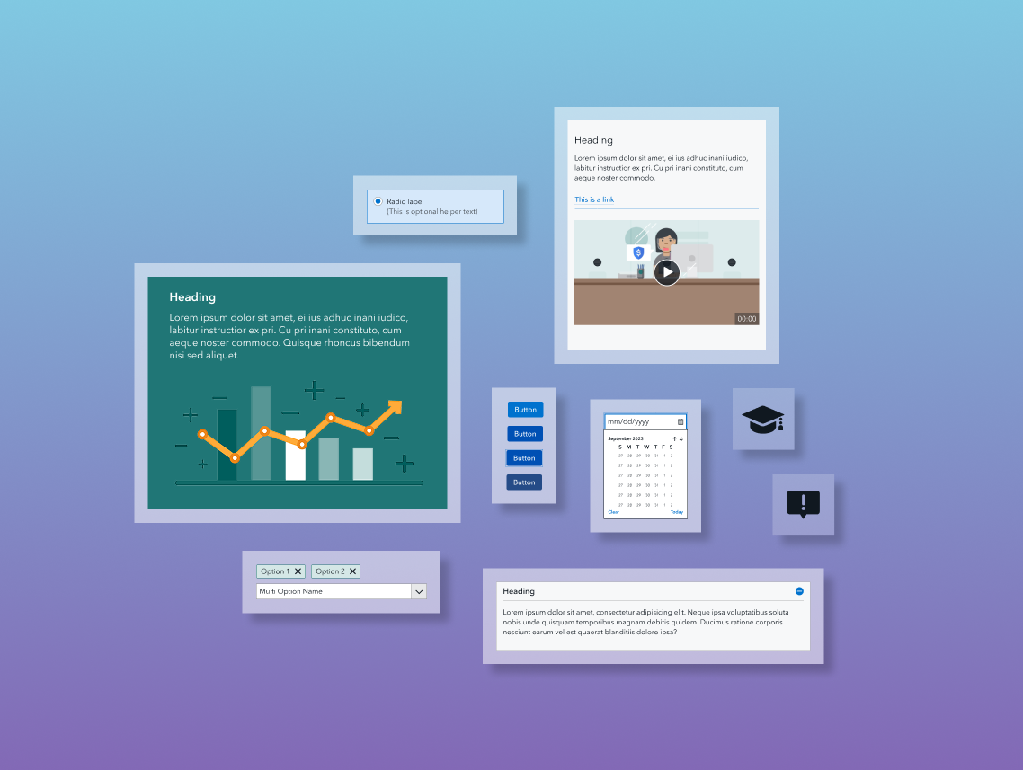
The audit also helped us articulate content buckets to use on the landing pages. Combining ideas from IDEO’s research and our own from the audit, we arrived at a handful of categories, such as key terms, common issues, know your rights, and how-to guides. This clarity enabled us to create wireframes of potential page layouts.
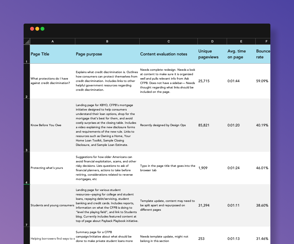
Audit to identify potential categories and content to include in the money topic sections
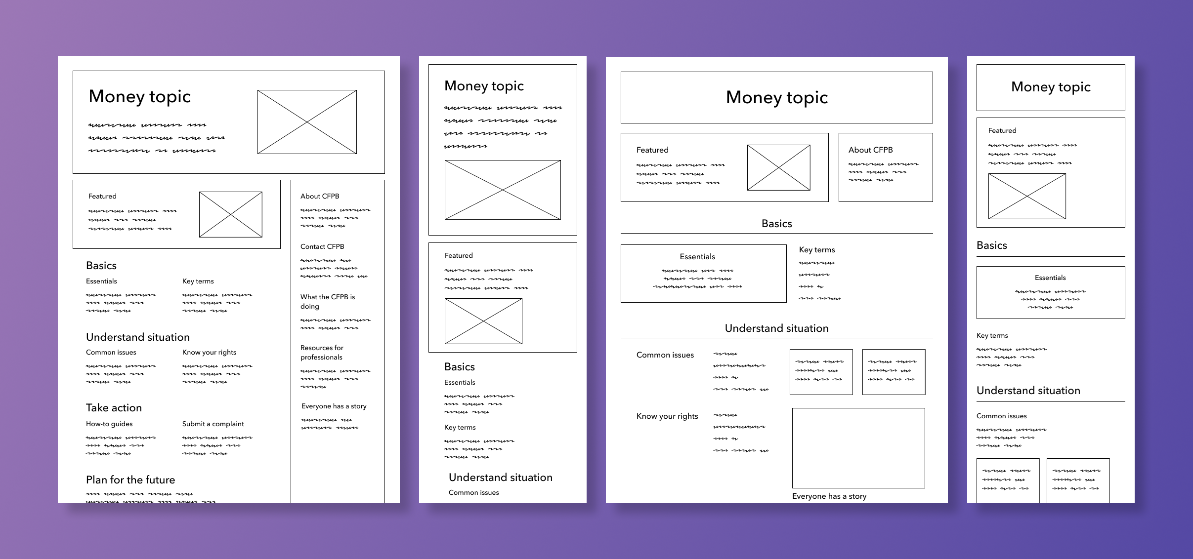
Wireframes I created of the money topic landing page structure
Prototyping & testing
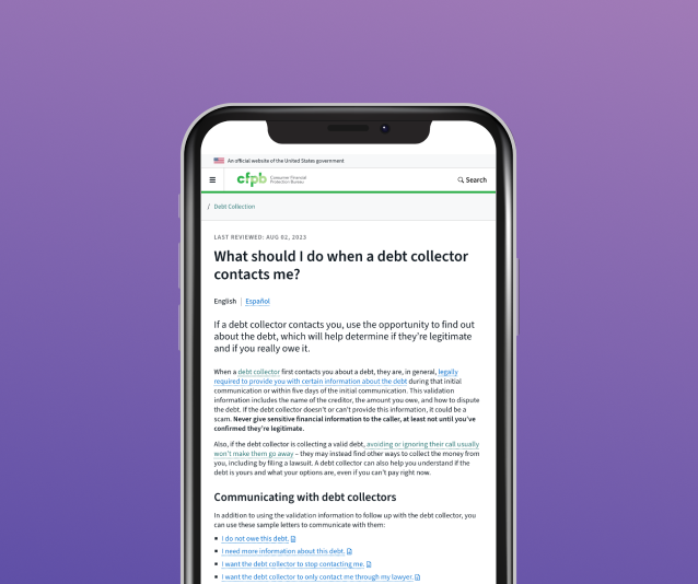
Choosing one money topic—debt collection—we moved from wireframe to design. We reviewed the content audit as well as facilitated a workshop with content owners and subject matter experts to brainstorm core content. The workshop helped clarify both user and business goals.
I prototyped two landing page designs, which we usability tested. Among our findings: participants understood most of the content categories but found some to be confusing. And while participants didn’t click links in the sidebar, they appreciated the variety of information it provided, particularly “About us” and the CFPB’s phone number, which elicited trust.
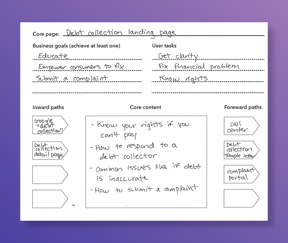
Content worksheet to identify core content for the debt collection landing page
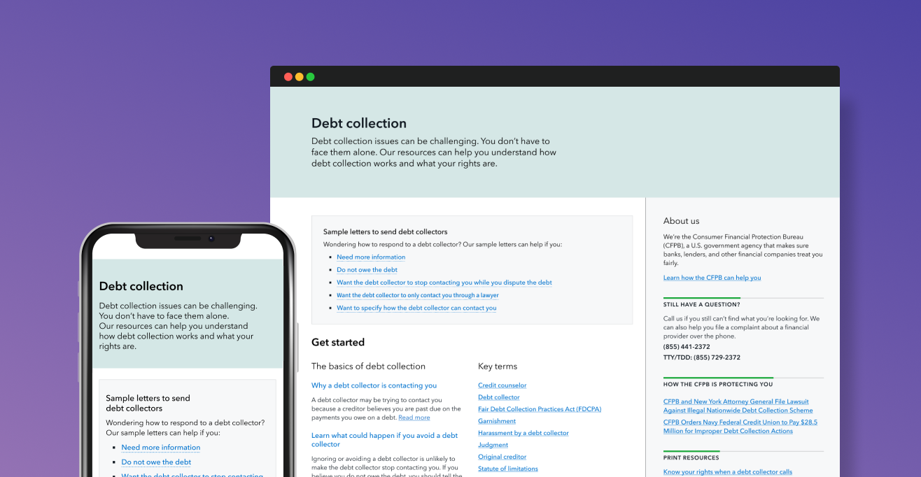
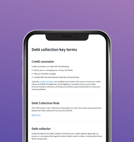

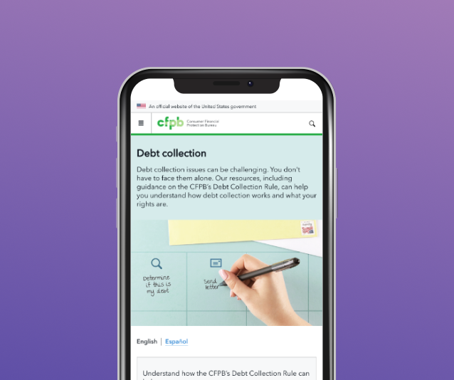
Debt collection section I prototyped
Creating visuals
Next, I turned my attention to planning and facilitating brainstorms and sketch sessions to determine visual messaging and tone for the pages. We decided the pages should help consumers feel calm, organized, and able to take action.
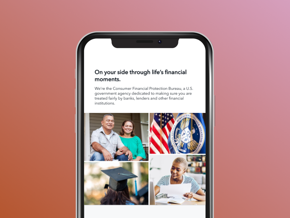
After establishing an art direction, I created photo concepts, gathered props, recruited CFPB staff to serve as models, created a photoshoot plan, art directed photoshoots, and edited the photos for final placement on the pages.
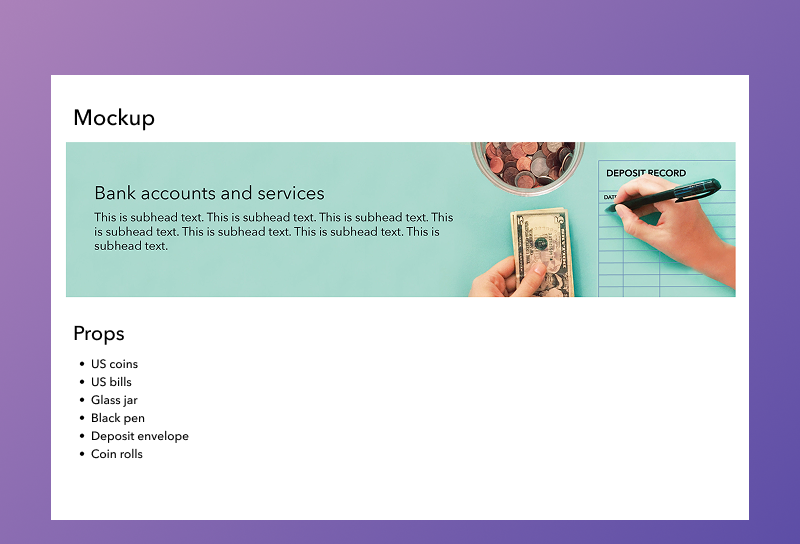

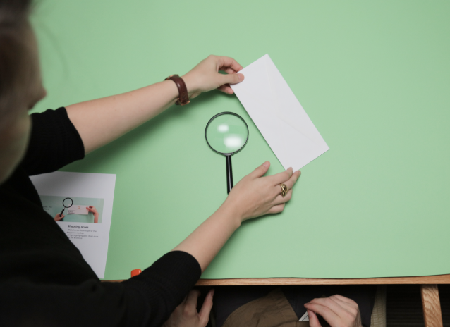

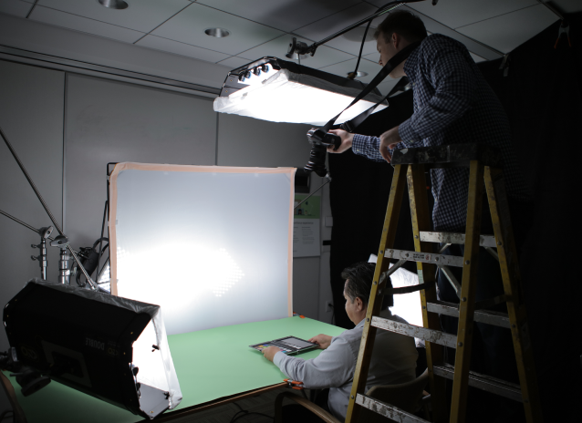
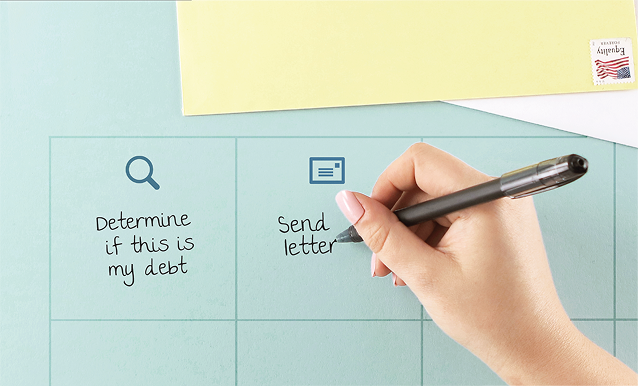

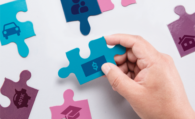
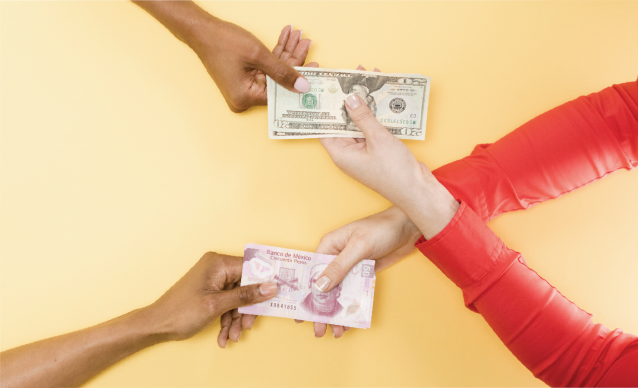
Photoshoots I art directed and final money topic photos
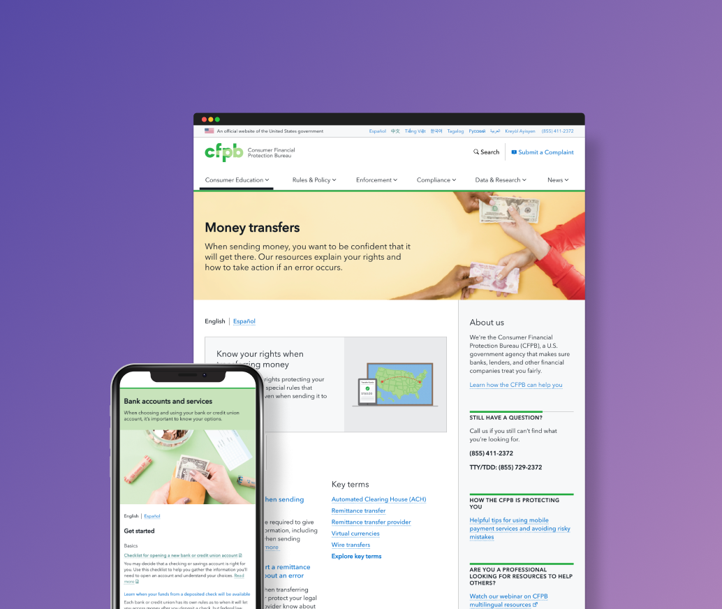
The result
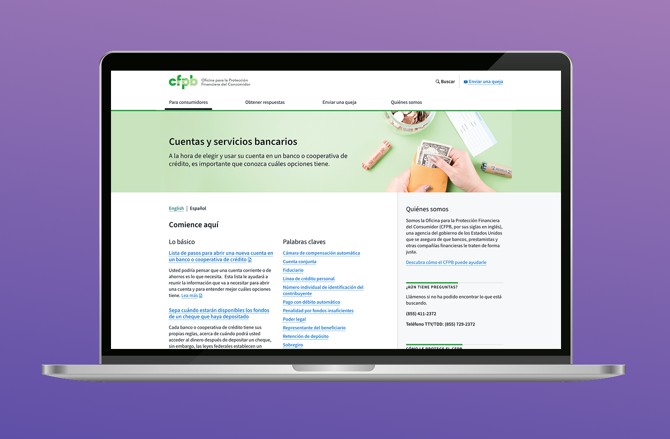
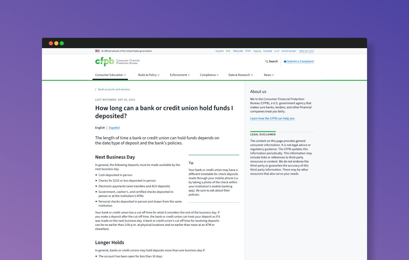
Launching on a rolling basis, we now have 12 money topic sections on the site, and all sections have been translated into Spanish.
Followup usability testing on the debt collection landing page and section revealed similar insights to our pre-launch testing: participants understood the page organization, were able to scan and find information they needed, and had positive reviews of the CFPB’s phone number and “About us” information in the sidebar.
A look at site analytics for 2025 revealed that seven pages in the section are within the 25 most-trafficked pages on consumerfinace.gov, a site containing 14,000+ pages. The debt collection landing page is the sixth most-trafficked page on the site, indicating that these pages are valuable resources for consumers navigating financial issues.
7
money topic pages are now within the 25 most-trafficked pages on the CFPB’s site
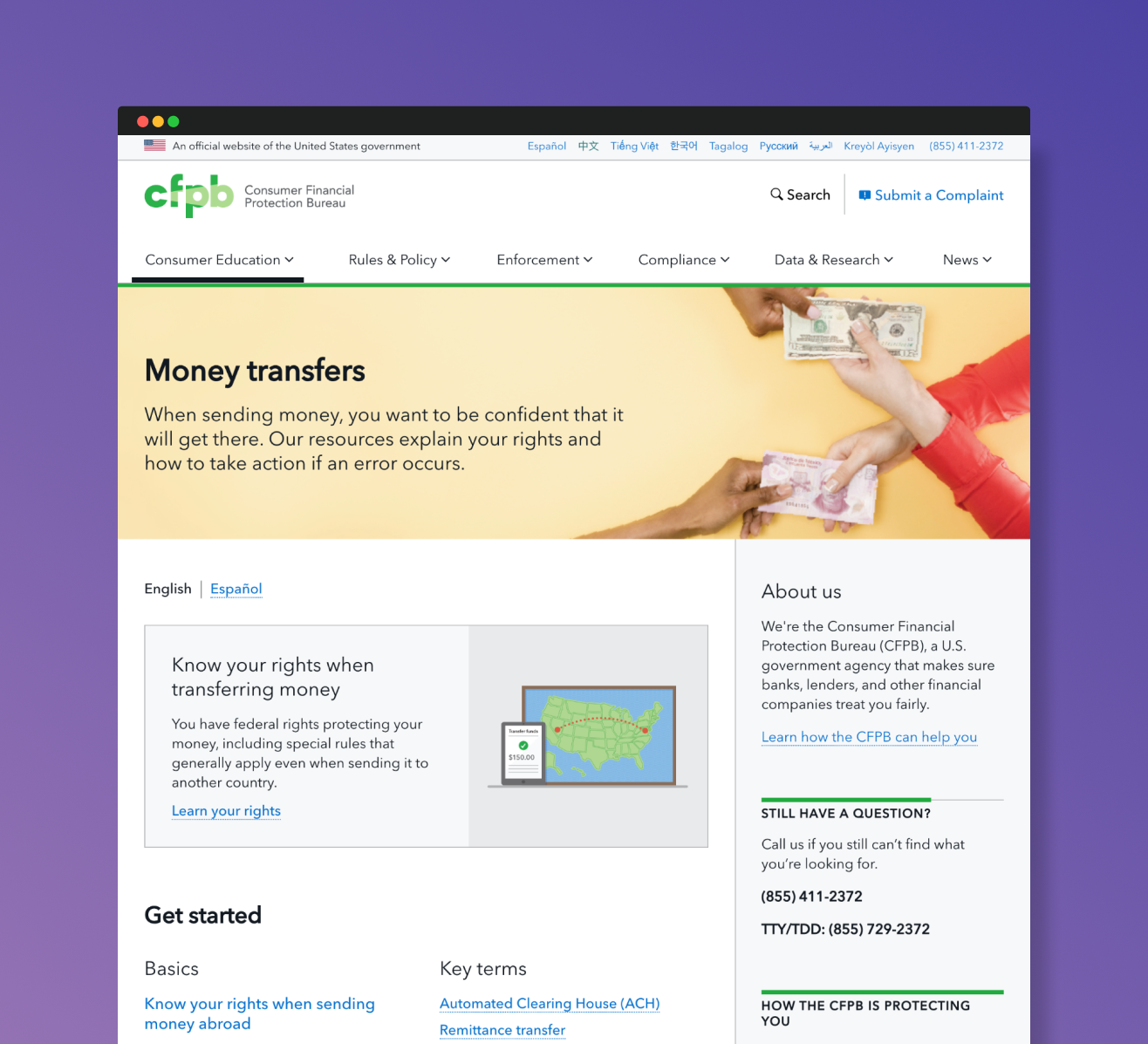
Final navigation and money topic pages I designed