Improving mobile navigation
Visitors to consumerfinance.gov were overlooking a key navigation component that appears on nearly 1,000 pages and is sometimes the only way to navigate to a page’s sibling or child pages. I designed and tested a modified menu, leading to a 70% increase in the menu’s discoverability and usability.
About the project
Challenge
Modify the design of a key navigation menu to increase visitors’ ability to navigate consumerfinance.gov and find the information they need
Project team
UX/UI designer (me)
Jr. UX/UI designer
User researcher (me)
Front end developer
My responsibilities
Component design
User research
Design mentorship
Reviewing research
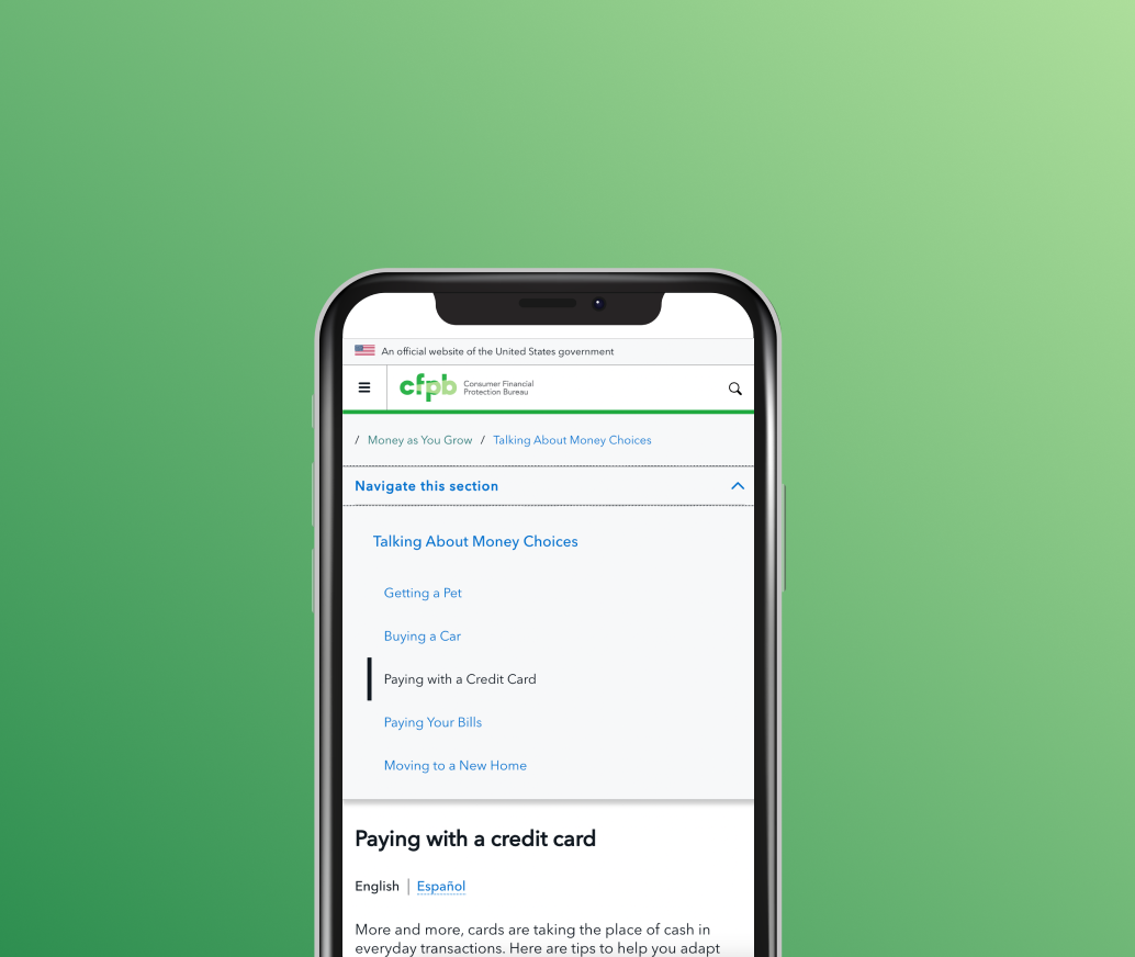
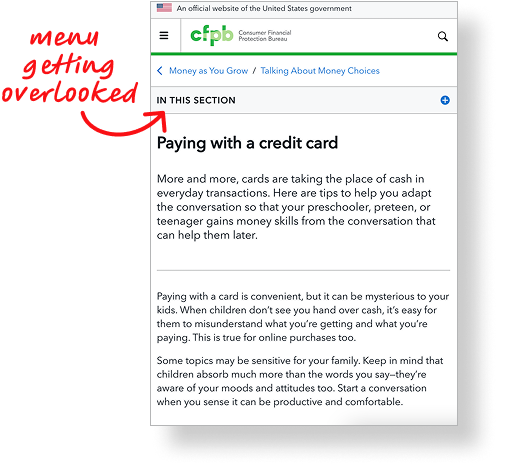
During usability testing of our site’s high priority components, we saw that participants struggled to notice and interact with the section menu.
Reviewing heat maps of live pages that contain the section menu further affirmed low engagement with the menu.
955
pages on the CFPB’s site contain the section menu, making it a key navigation pattern
Prototyping
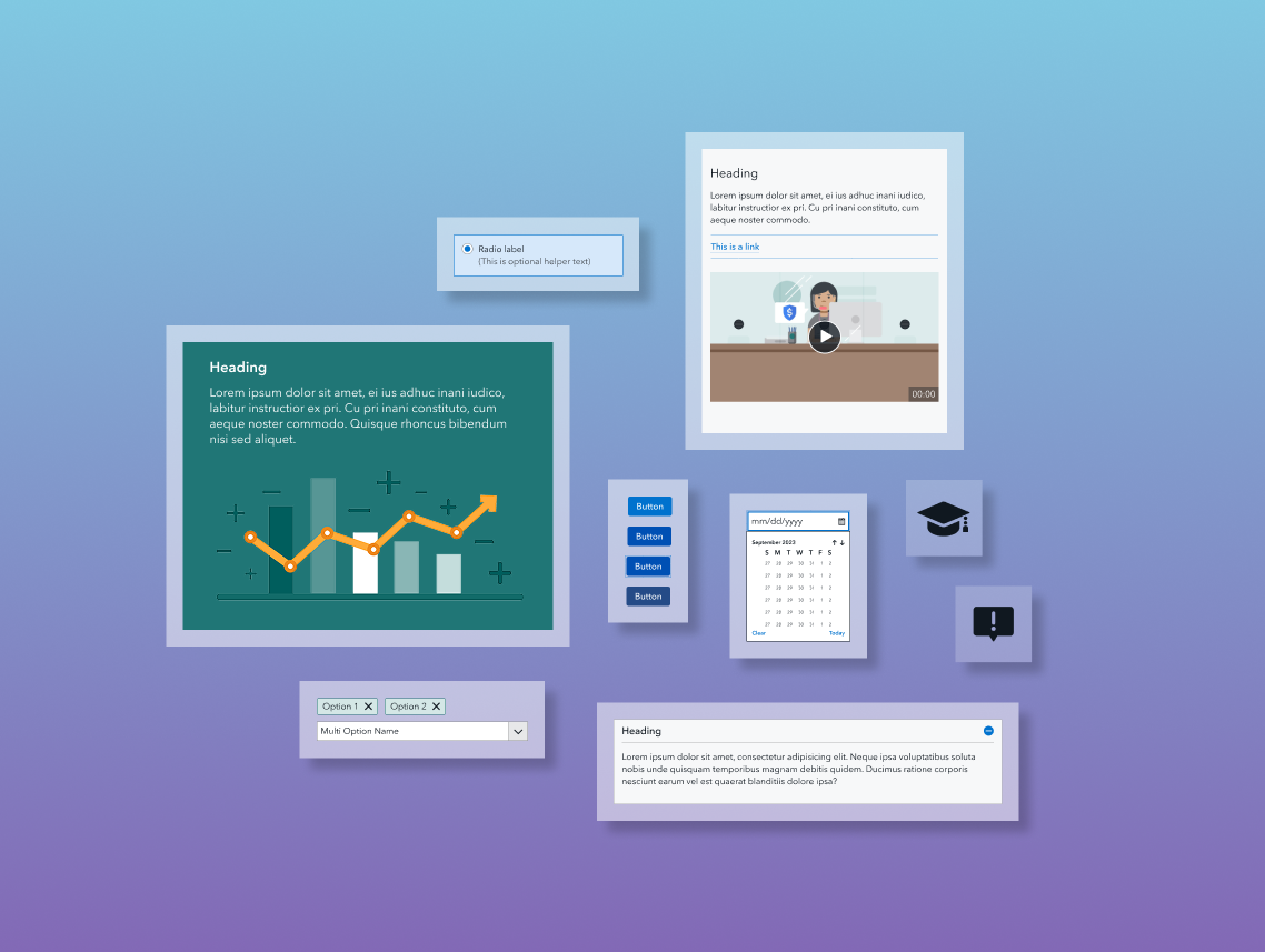
To redesign the menu, I performed a competitive analysis of section menus on other sites. I then sketched menu alterations, focusing on subtle design changes to the wording, color, and icon. I considered ways to make the menu stand apart from in-page components while also fitting seamlessly with other navigation components. In addition to the section menu design, I experimented with truncating the breadcrumb to shorten its footprint and free up top-of-page screen space.
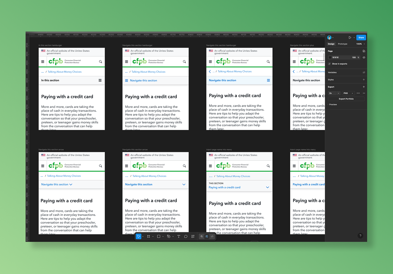
Modified section menu designs that a jr. designer and I created
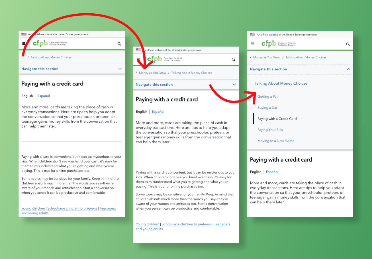
New section menu design with a truncated breadcrumb
Usability testing
After arriving at a modified section menu design, I planned and conducted a usability test to evaluate the discoverability, design, and interaction of the menu and truncated breadcrumb. After running an unmoderated test with 9 participants, reviewing test session videos, and synthesizing findings, I saw that participants interacted successfully with the modified section menu design but struggled to notice and interact with the truncated breadcrumb.
Based on these findings, I un-truncated the breadcrumb and kept the modified section menu design in place. I ran a second round of the usability testing with 9 participants, which showed a significant increase in participants’ discovery and use of the breadcrumb.
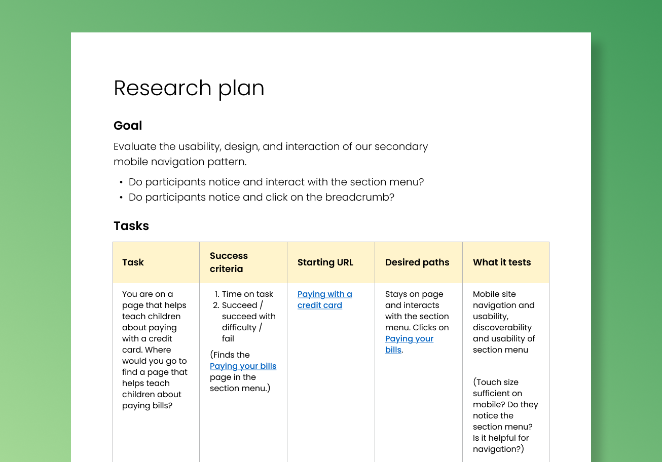
Usability testing plan I created to evaluate the modified section menu
The result
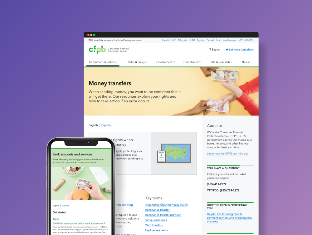
Following usability testing, we launched the modified section menu. Several months after launch, we used Mouseflow to observe visitors successfully finding, opening, and using the menu to navigate. In addition, routine usability testing of the site’s high priority components revealed that 100 percent of test participants were able to locate and use the modified section menu.
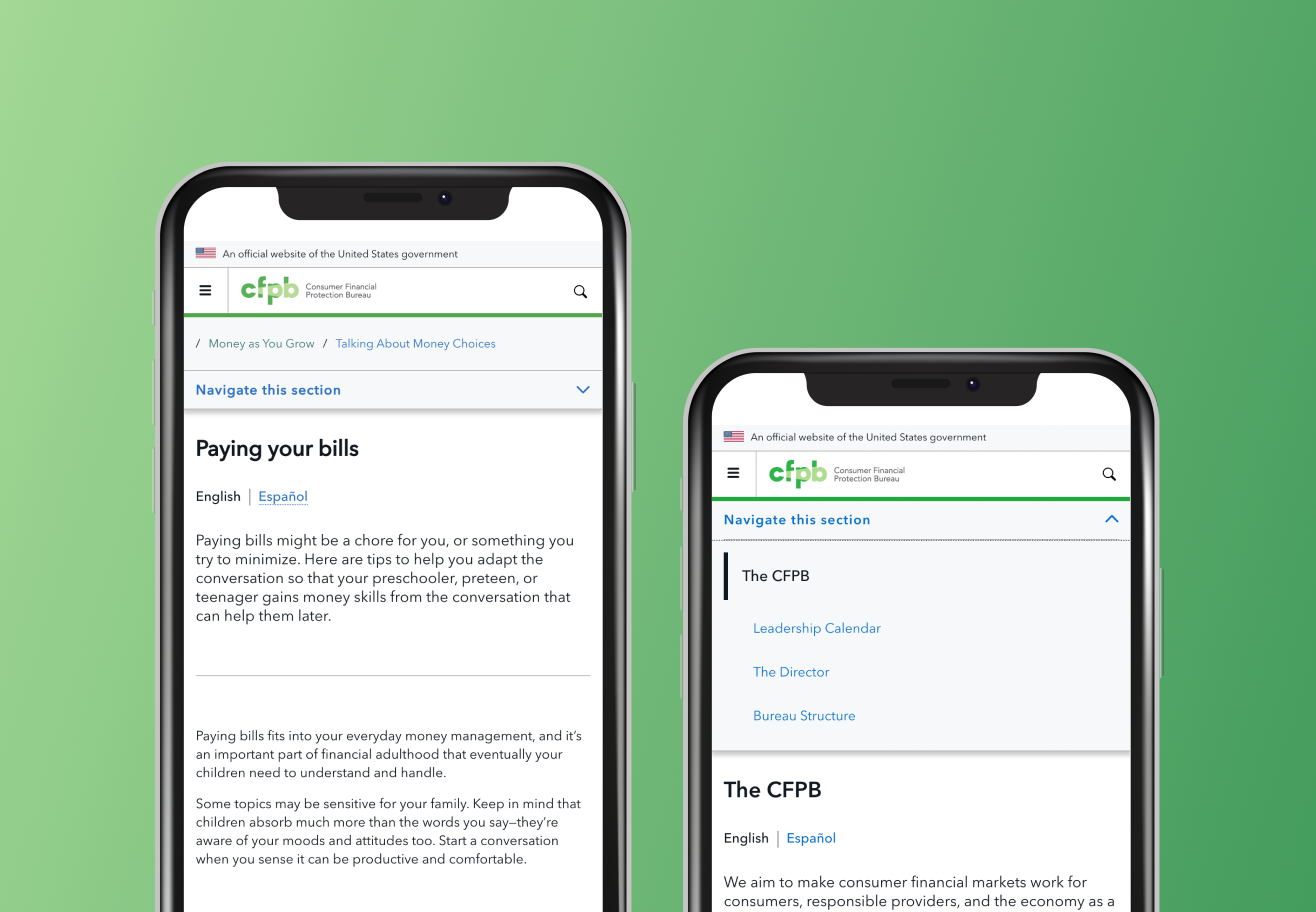
Final section menu design
100%
of participants in followup usability testing located and used the redesigned section menu