Creating a reassuring homepage
The consumerfinance.gov homepage is the face of the Consumer Financial Protection Bureau (CFPB), and with an administration change came the desire to rework the page to reflect a new vision.
I redesigned the page to speak directly to American consumers and lead them to critical resources.
About the project
Project team
UX/UI designer (me)
User researcher
Product manager
Front end developer
Back end developer
My lead responsibilities
Product design
Art direction
I also contributed to…
User research
Workshop facilitation
Reviewing research
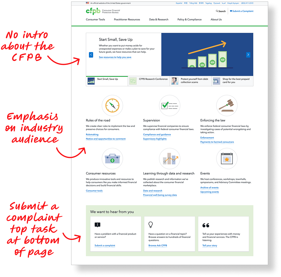
To begin, my team gathered insights from prior usability research, analytics, and interviews with CFPB call center representatives to better learn what consumers may be looking for on consumerfinance.gov.
We learned that visitors were most-often seeking to submit a complaint followed by looking for information about financial topics such as prepaid cards, debt collection, and credit reports.
We also learned that many consumers didn’t understand who the CFPB is and what the agency can do for them.
Articulating goals
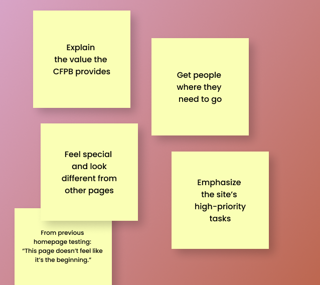
To connect with stakeholders and understand business goals, we brainstormed who the page should serve, what tasks it should help people accomplish, and what experiential and emotional qualities it should have.
Page goals
We determined that the page should introduce the CFPB, explain the value the agency provides, and get people where they need to go.
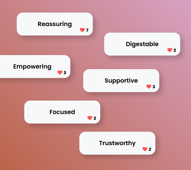
Emotional qualities
We wanted the page to feel reassuring to consumers and express that the CFPB has their back. It should empower consumers and help them feel supported.
Workshops with stakeholders to articulate the page’s goals and tone
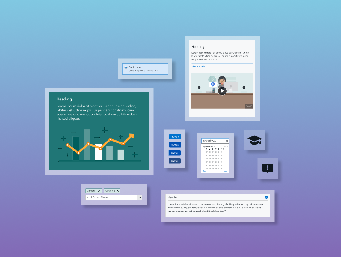
Wireframing & prototyping
To design the page, I conduced a competitive analysis of other government and financial tech homepages, sketched with stakeholders and teammates to generate ideas, and created wireframes. Once we determined a layout, I created a prototype and chose visuals.
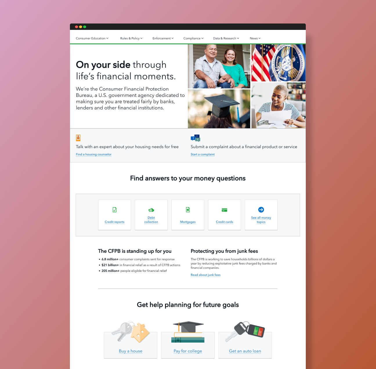
Prototype I created for usability testing
User testing
To validate the design, we conducted three types of testing.
First impression testing: We gave participants time to view the design and then asked for their reactions. Participants gave positive feedback about the page’s design and organization. Most understood the page’s purpose, but not all understood that the CFPB is a government agency.
Usability testing: We gave participants a series of tasks to help us assess the navigability and usability of the page design, which revealed that most participants understood the page’s sections and where specific links would take them.
Desirability testing: We showed participants four page introduction visuals along with a list of key words, asking them which words best described each image and which image they preferred. Participants were most able to see themselves in a photo collage option, and they felt it represented the services and products the CFPB offers.
“This page is very encouraging and supportive. It speaks to me one-on-one that hey, I’m here for you and will protect you from financial harm.”
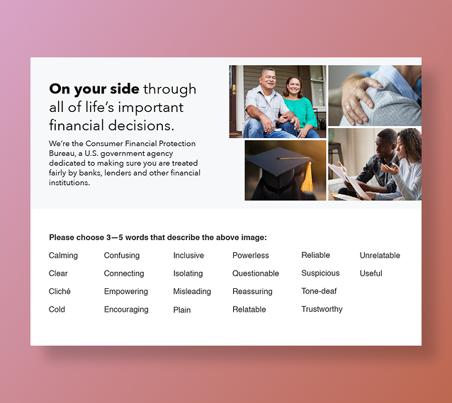
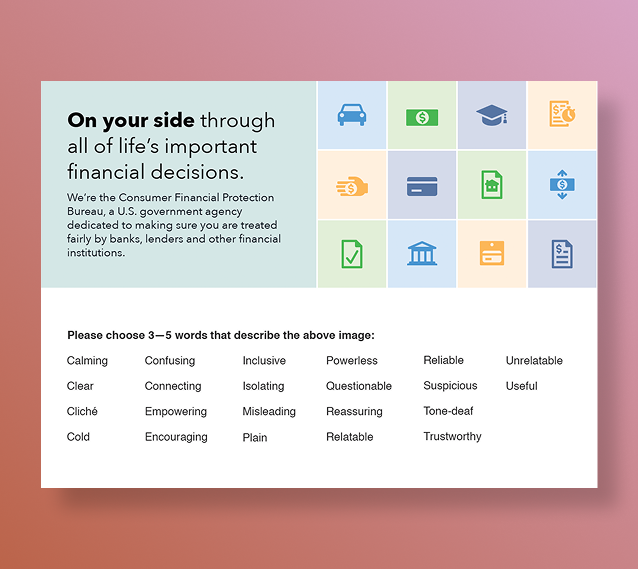
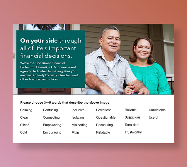
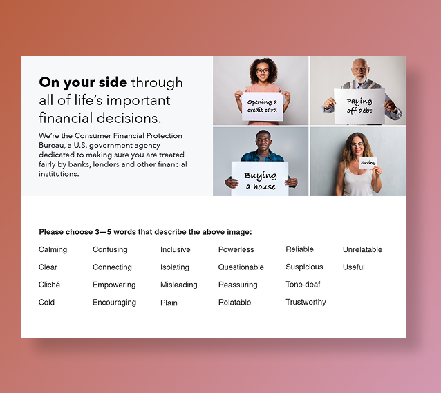
Introduction image options I created for desirability testing
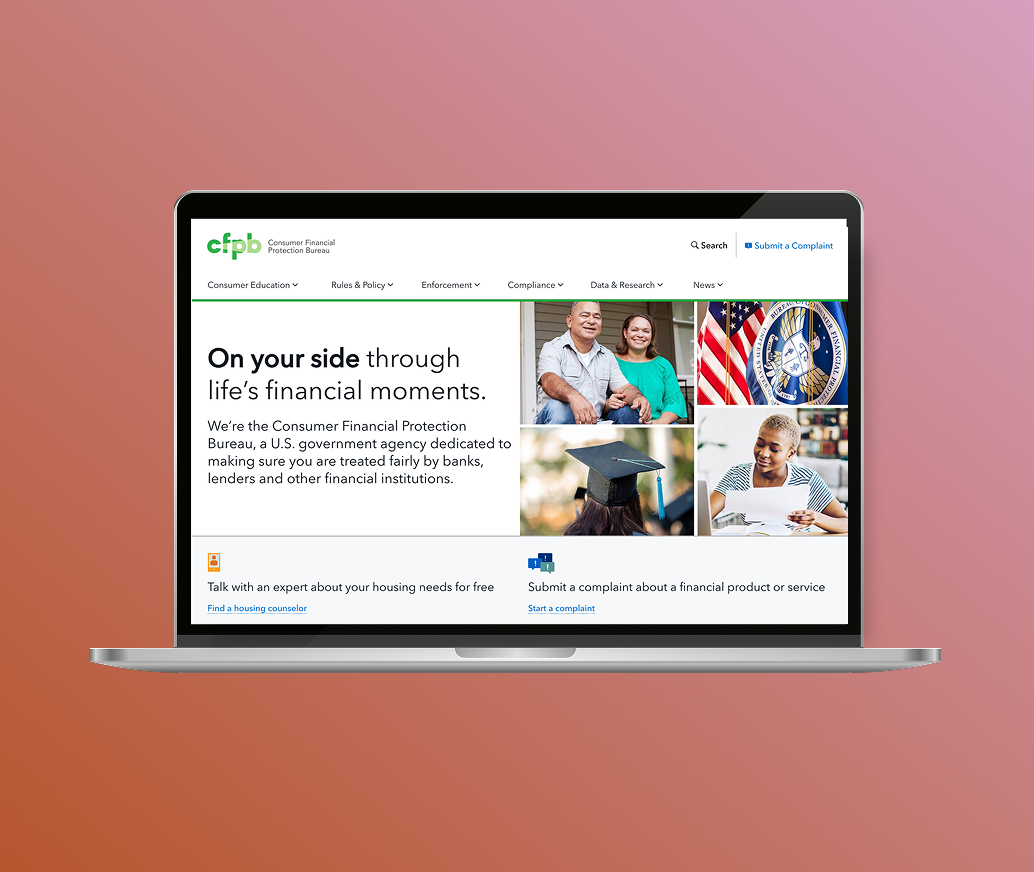
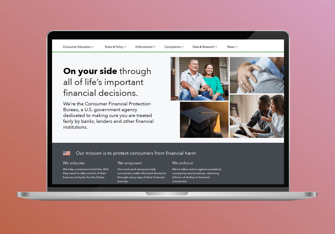
The result
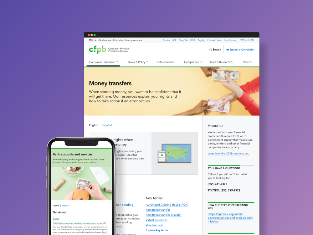
After making changes reflective of our research findings, we refined and launched the page. Followup revealed heavy engagement with the introduction and key links. And routine usability testing revealed that consumers understood how to complete a key task of the page—navigating to the submit a complaint tool—with a 100 percent task success rate locating the Submit a complaint link on the homepage.
With
24M
active site users, the homepage is the face of CFPB’s site
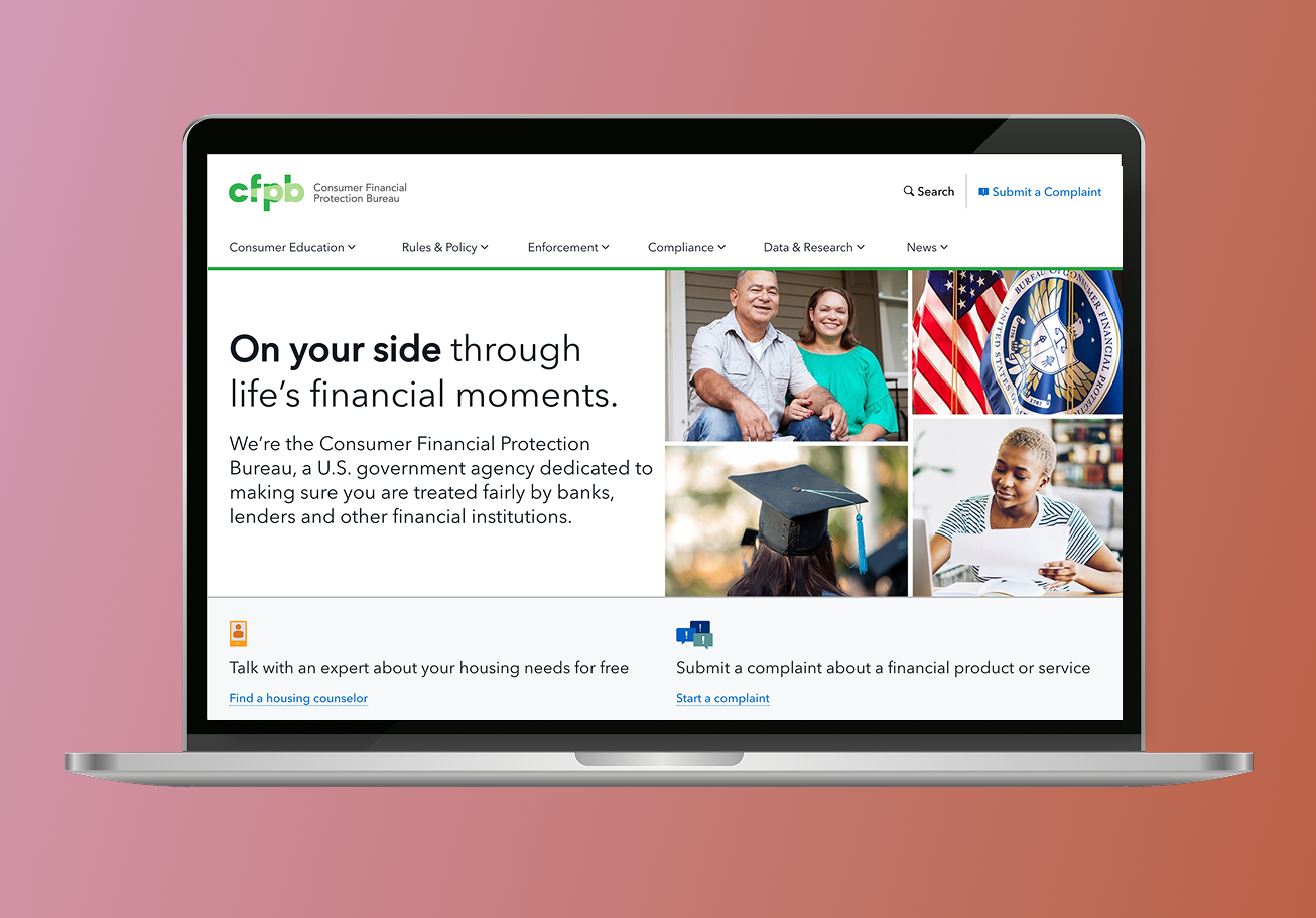
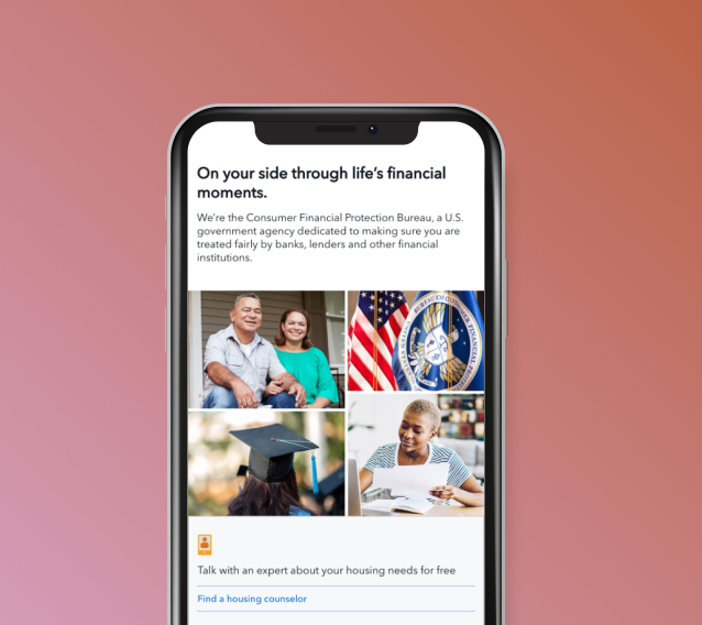
Final consumerfinance.gov homepage I designed